Anna Klaassen ![#eye]()
![#eye]()
Digital designer & multimedia artistAbout me
LinkedIn︎︎︎
Product | UX/UI
Web | Creative Coding
Sculpture | Installation
Photography | Painting
Kippie Ceramics︎︎︎
Recover Cover
︎︎︎ 2023
︎︎︎ UX/UI
︎︎︎ Mobile
︎︎︎ UX/UI
︎︎︎ Mobile
Improving friction points in the HCF Recover Cover landing page* through Experimentation Design practices. I created two design variations, ready for A/B testing.
Current state review
- Heavy copy and long pieces of text
- Lacking scan-ability and natural page flow
- Product tiles are not distinguished from other content
- Users are unable to find the right product for them
- Content is not tailored for a mobile device.
Main changes implemented
- Reframed Recovery Cover and product discovery
- Allowed users to click through to a product page
- Helped users understand which cover is right for their needs
- Removed grey border and reduced page length.
Implementations across both variations
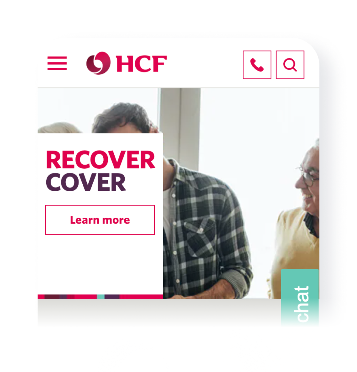
Hero banner
Opportunity for improvement: The hero takes up a lot of space and does not explain what Recover Cover is.
- Framed the product into the hero
- Added subheader text to add context
- Added a button to direct the user straight to the product tiles.
Current state
![]()
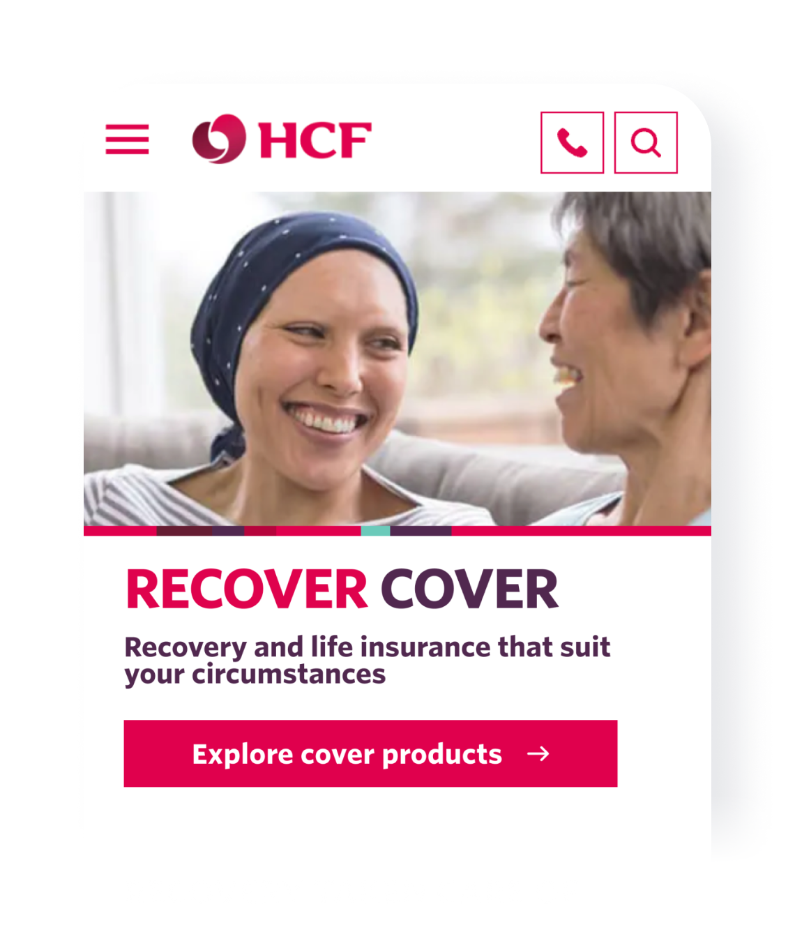
Variation 1 & 2
![]()
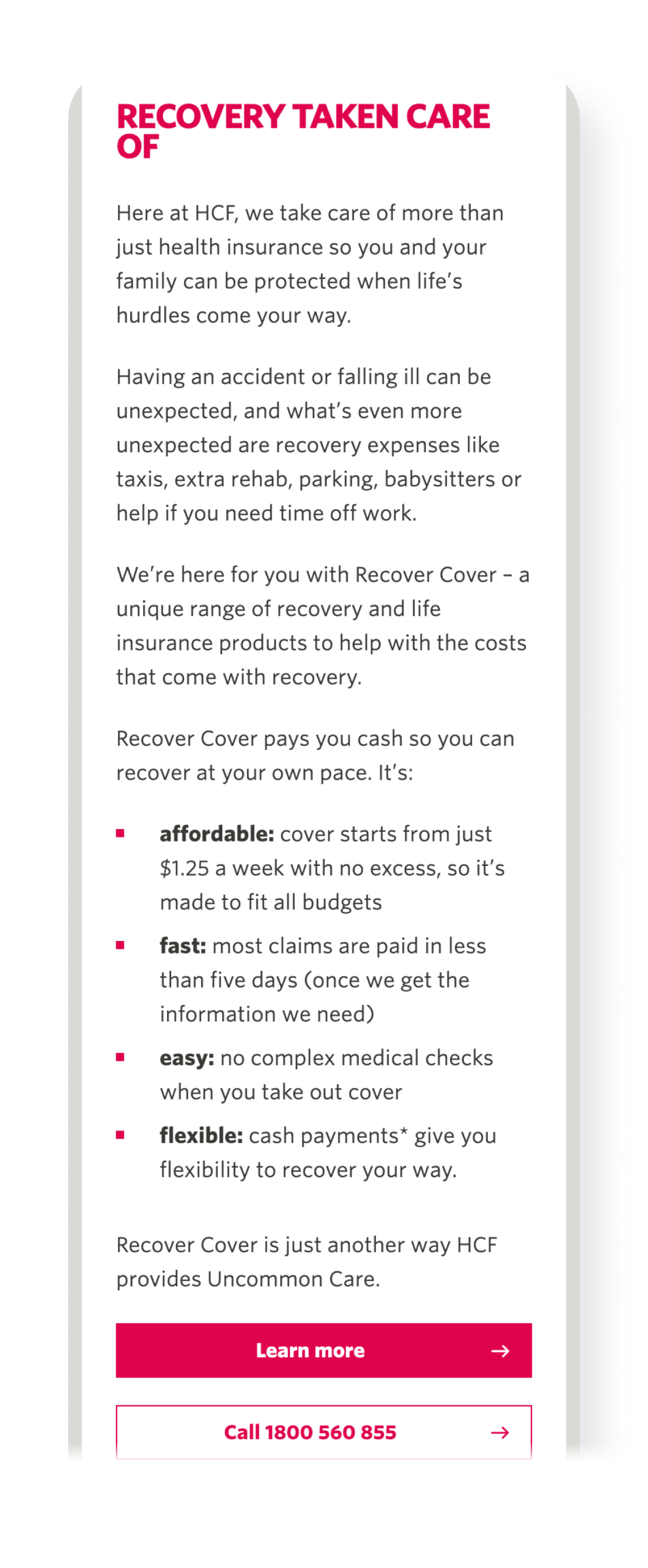
USPs supported by icons
Opportunity for improvement: The Recover Cover description is long, text heavy and is lacking scan-ability. The call button enourages users to contact the call centre rather than scrolling further through the page. This could result in overwhelming their customer service team.
-
Created a shorter summary to cut down content
- Added icons as visual cues and better scan-ability
- Removed “call” button to keep users on the page. If direct contact support is needed, the phone number is in the footer.
Current state
![]()
Variation 1 & 2
![]()

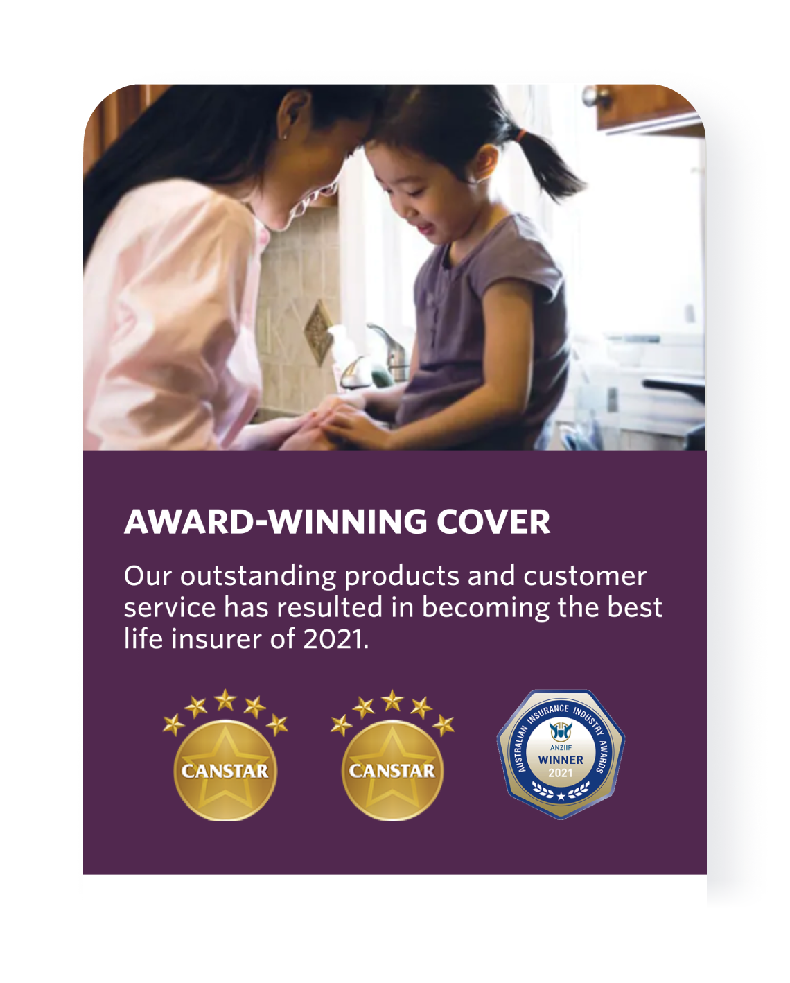
Awards content block
Opportunity for improvement: Increase trust with customers by placing awards onto the page.
- Created an “award-winning cover” content block that shows all award badges.
Current state
x
x
Variation 1 & 2
![]()
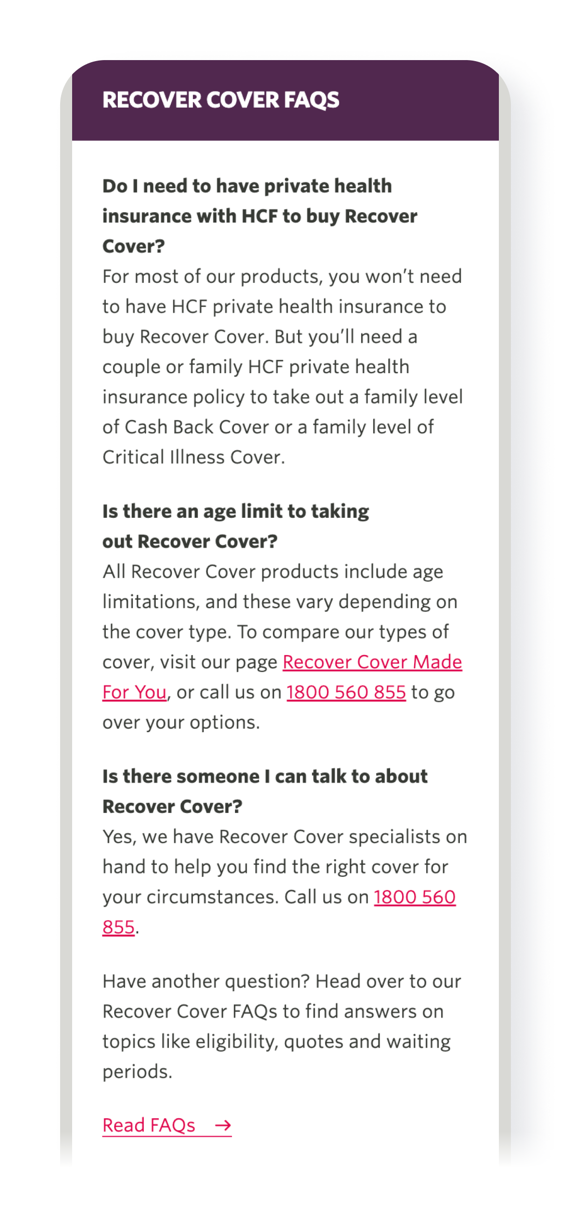
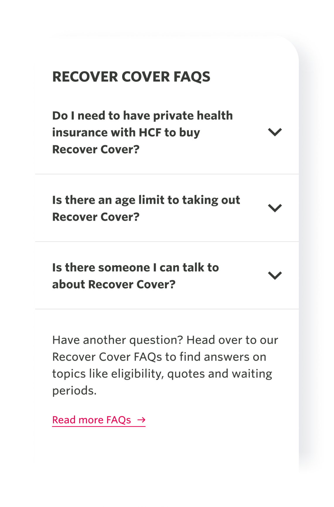
FAQs accordion
Opportunity for improvement: The FAQs section is long and needs to be reorganised to reduce page length and add structure.
- Placed FAQs in an accordion.
Current state
![]()
Variation 1 & 2
![]()
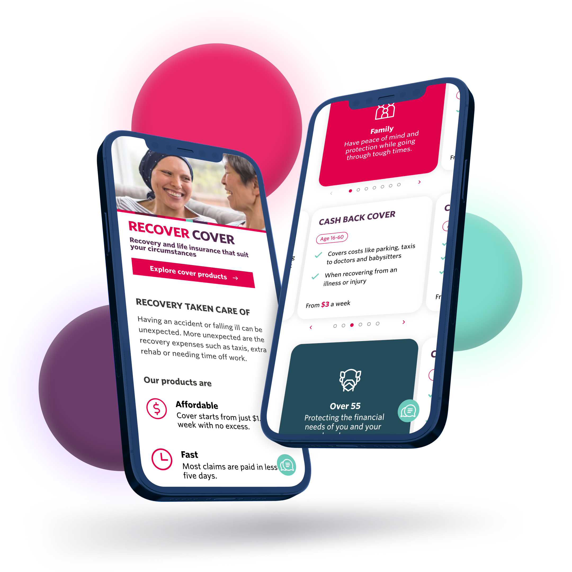
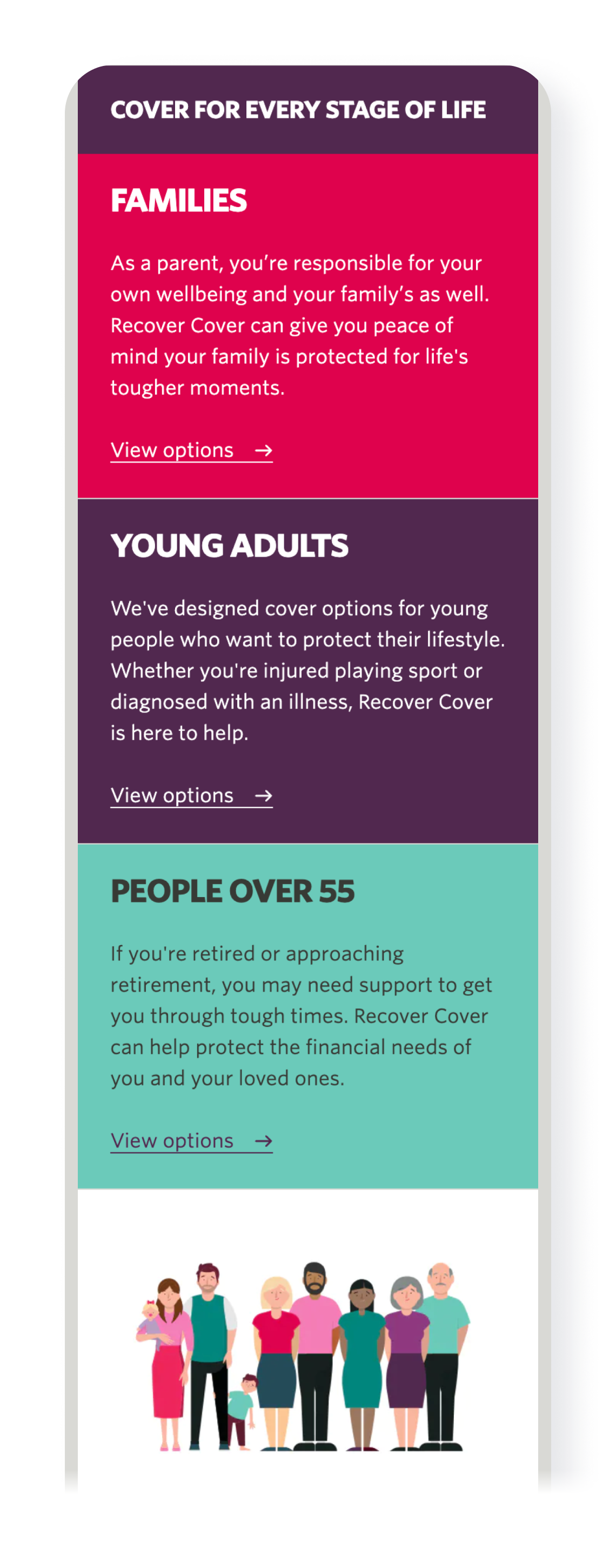
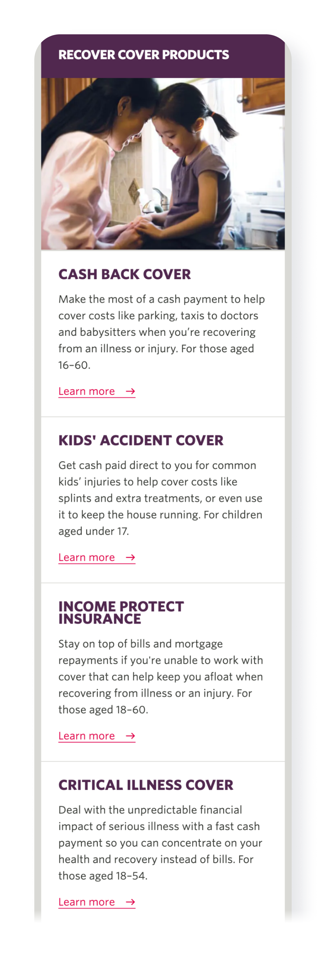
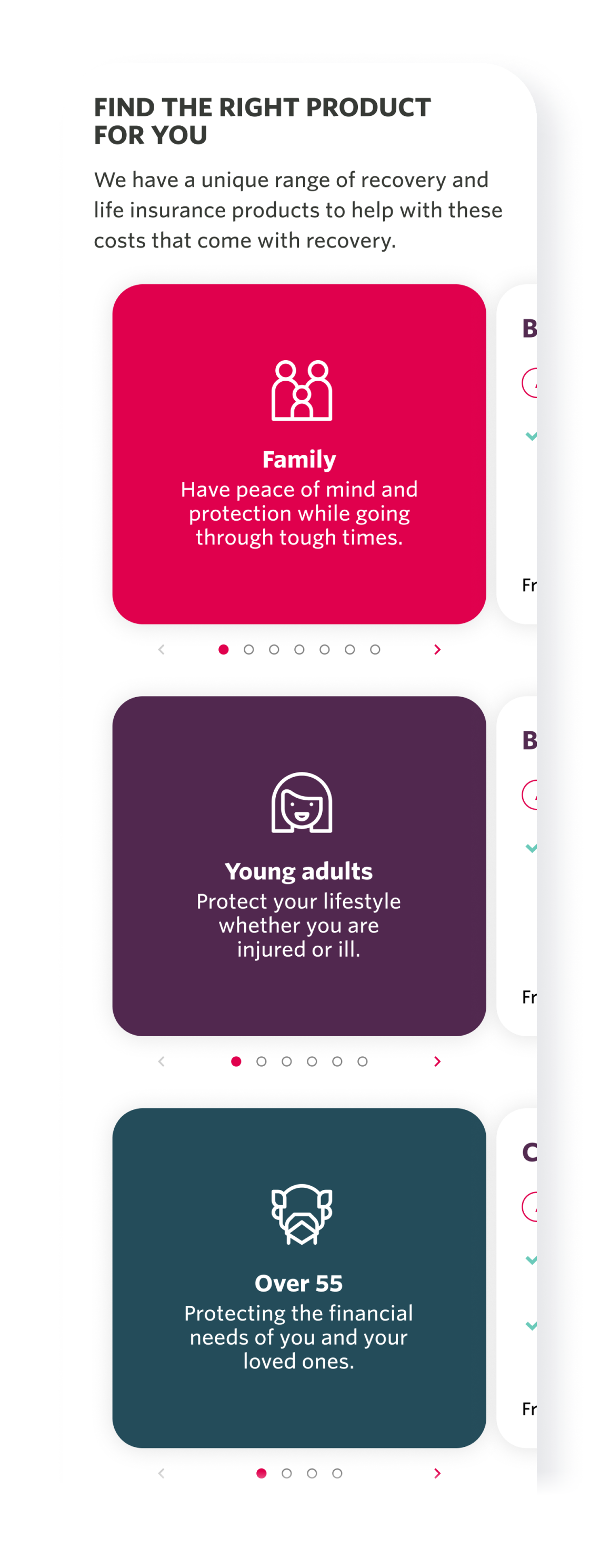
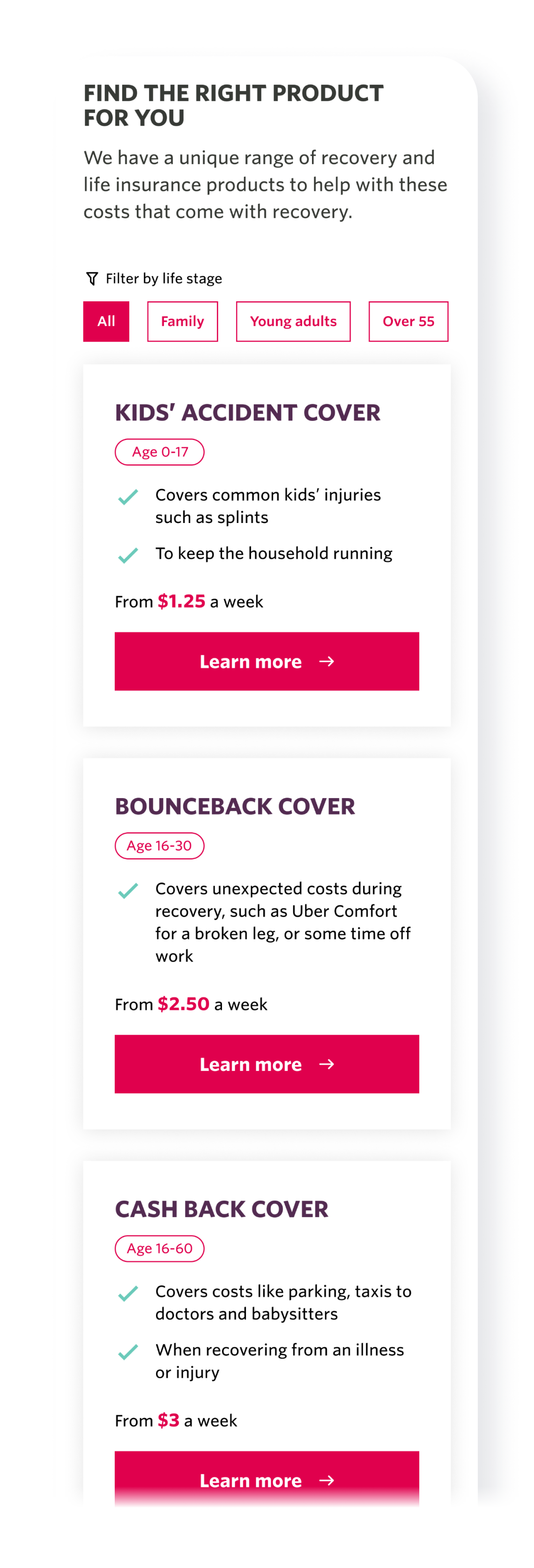
Product list and cards
Opportunity for improvement: The current product tiles do not look like product options. There is an opportunity to combine both product sections to create a more intuitive experience for the user. This will also allow for a shorter page length.
- Combined two content blocks from the current version and created one “Find the right product for you” content block
- Recreated the structure of the product tiles. Rewrote content into short points, added age range and included price
- Split the products into 3 HCF life stages: Family, Young adults and Over 55. This was added to the product tiles to prioritise life focussed content.
Variation 1
Dividing products into life stages with the ability to scroll through.
Current state
Variation 1
![]()
Variation 2
Ability to filter products based on life stage.
Current state
Variation 2
![]()
* The landing page was its current state in 2022. This was a self directed project and not implemented by the client.