Anna Klaassen ![#eye]()
![#eye]()
Digital designer & multimedia artistAbout me
LinkedIn︎︎︎
Product | UX/UI
Web | Creative Coding
Sculpture | Installation
Photography | Painting
Kippie Ceramics︎︎︎
Size dropdown redesign
︎︎︎ 2023
︎︎︎ UX/UI
︎︎︎ Mobile/Desktop
Improving friction points in the R.M. Williams product page* through Experimentation Design practices. I created a design variation ready for A/B testing, while focussing on the size dropdown section.
Users were unable to intuitively scan and understand if their size is available. The goal is to easily identify and choose a size that is right for them.
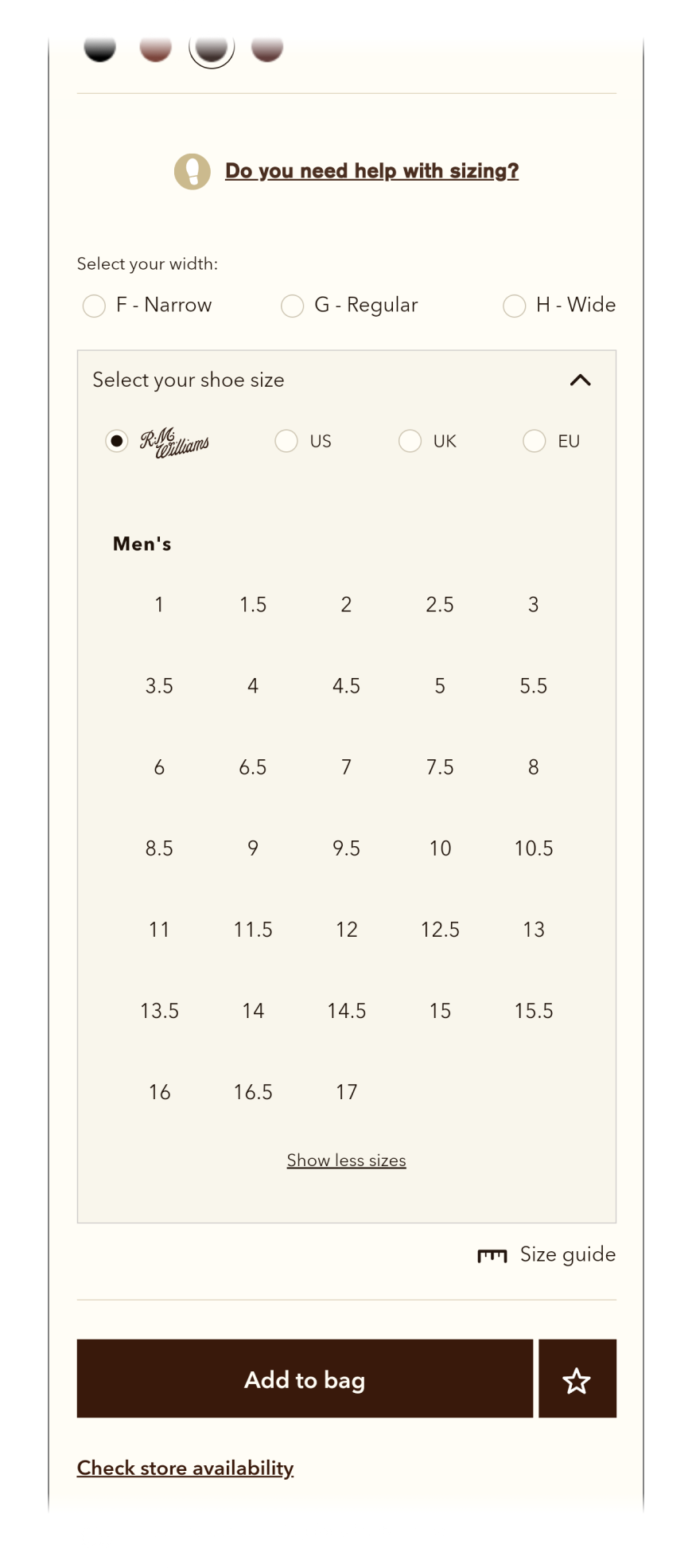
Current state
The size dropdown section
Mobile
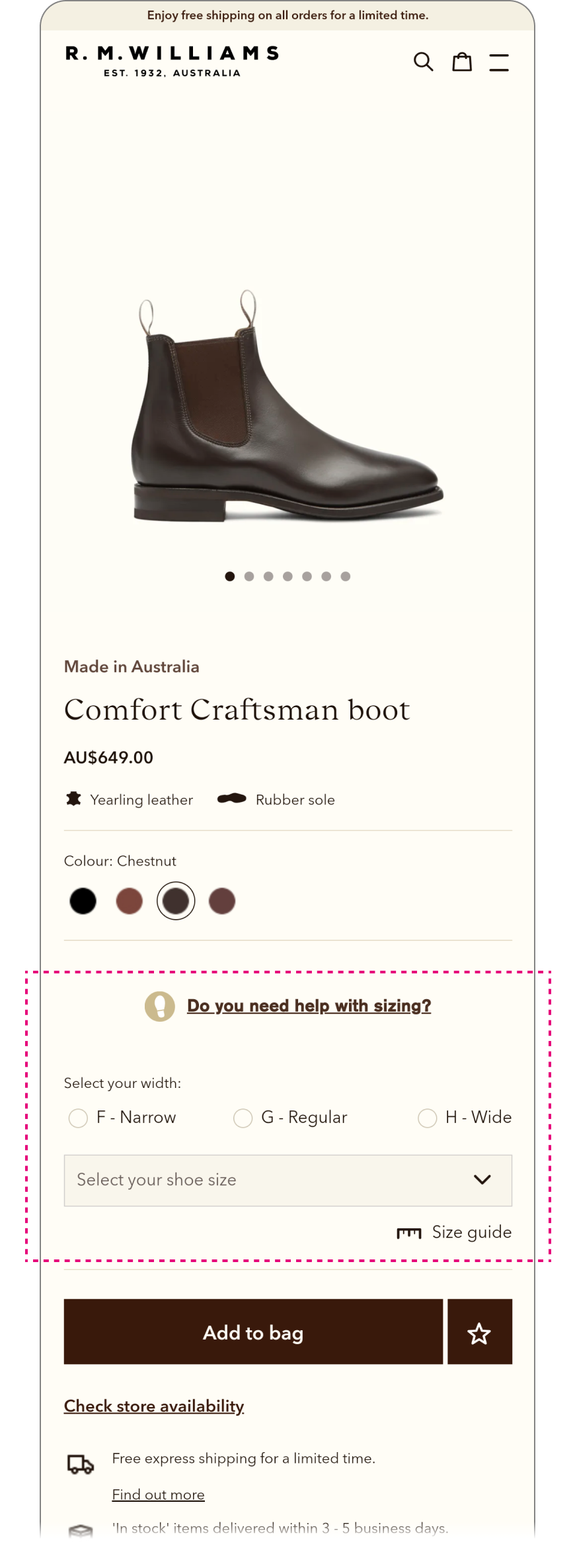
Desktop
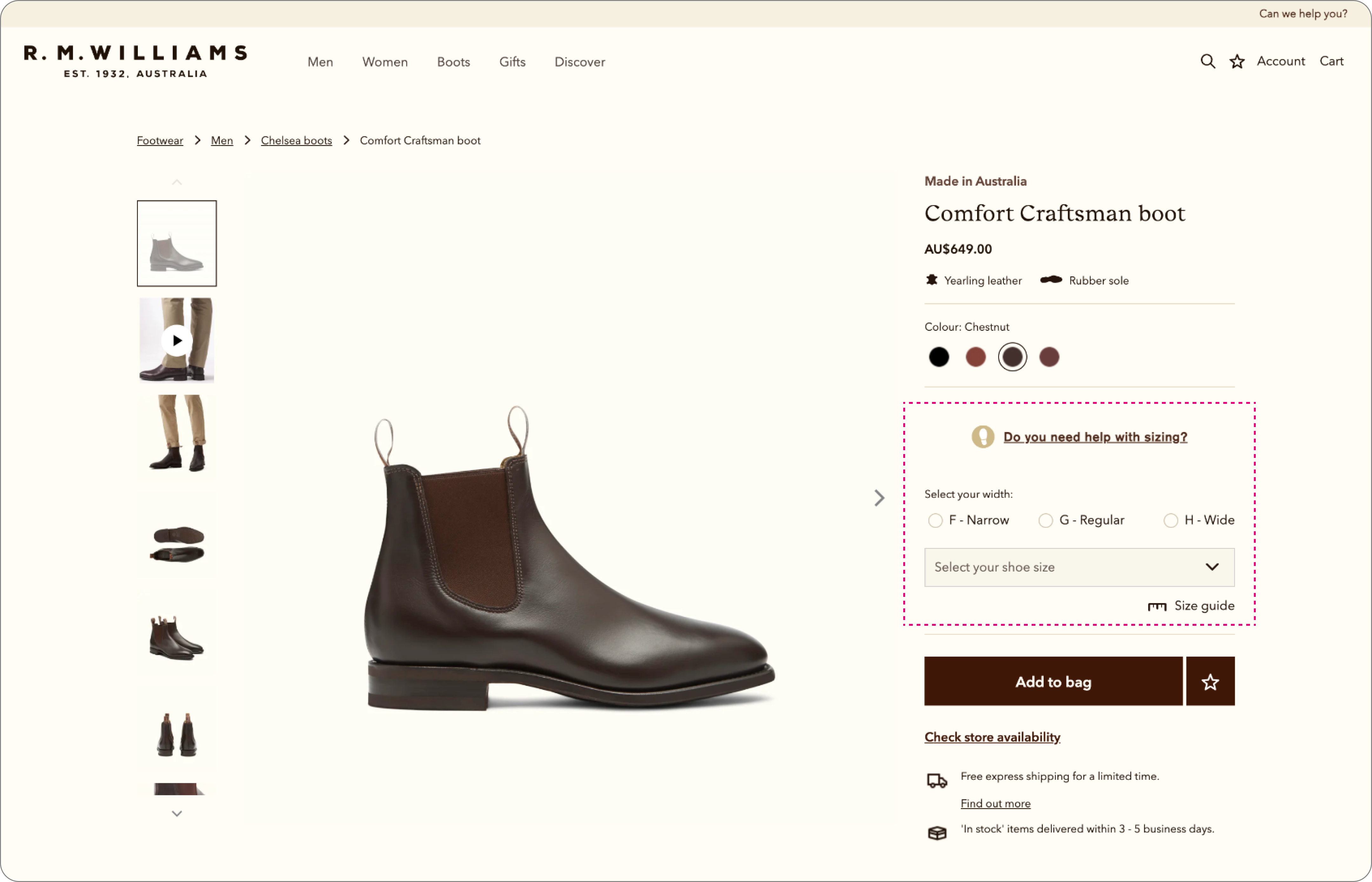
The user flow
1. Dropdown
![]()
2. Expanded
![]()

3. Extra sizes
![]()
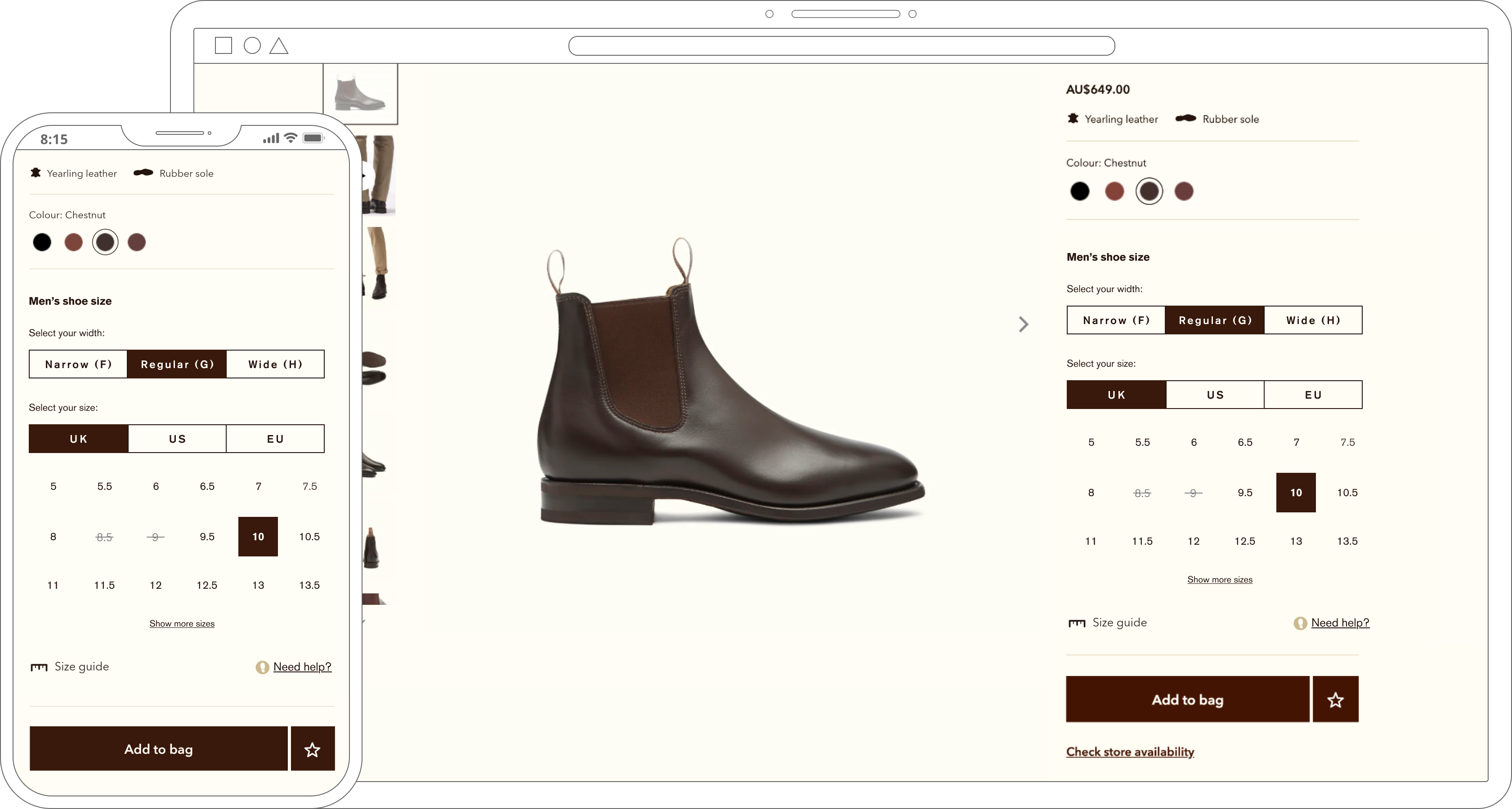
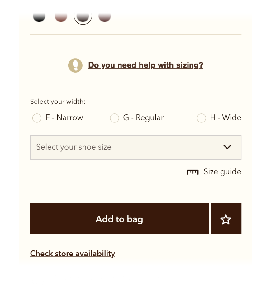
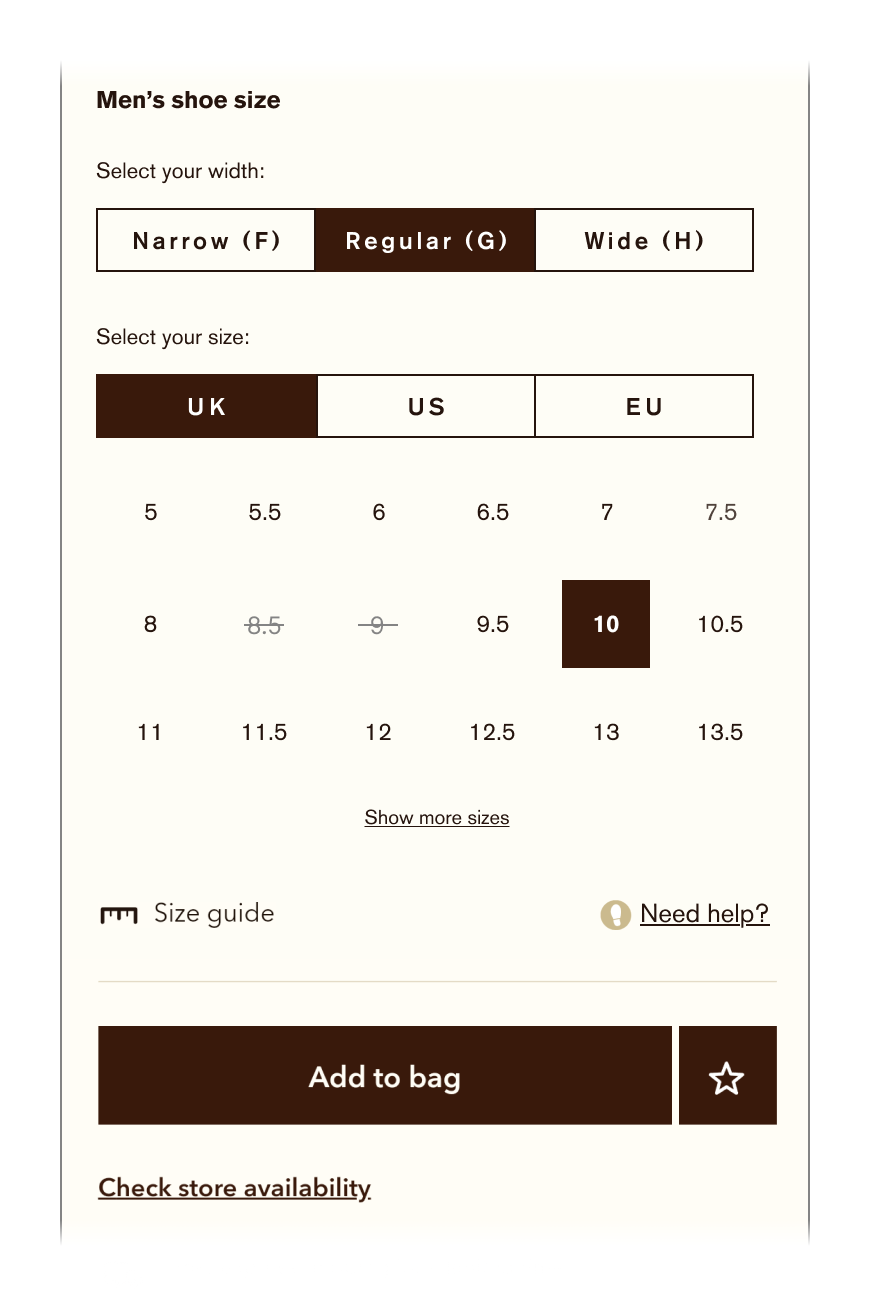
Improved version
Key changes
Altering the content hierarchy for a clearer user flow
- Moved the “Men’s” subheader to the top
- Moved the “do you need help with sizing?” element next to the size guide
Changing the interface to be more clear and accessible
- Changed radio buttons to button groups
- Removed R.M. Williams sizing as it is not a universal sizing metric
- Lightened and crossed out unavailable sizes to make it more obvious
- Changed “show all sizes” copy to “show more sizes”
Reducing the steps the user needs to take to select a size
- Removing the dropdown and displaying content up front
- Pre-selected shoe size and width for a quicker selection process
Current state
![]()
Improved version
![]()
* Referring to their website in its current state from 2022. This was a self directed project and not implemented by the client.